The exploration report is available under the Analysis Hub.
In this article, I am going to show you how to create and use the Exploration Report in Google Analytics 4 (GA4).
Exploration report overview
The Exploration Report represents your data in a dynamic table layout. You have the option to arrange rows and columns as you like, apply custom segments and filters to refine your data.
In the earlier legacy version of Google Analytics (known as Universal Analytics), you had the option to create a custom report under the ‘Customization’ menu option.
In the case of GA4, the custom report is replaced by the Exploration Report with a more advanced user interface and new functionality.
Introduction to available configuration options
Here we are going to see the various options available while configuring the Exploration Report. Follow the below steps to know more.
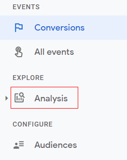
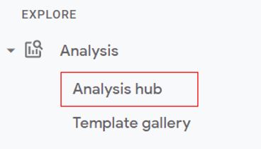
Step 1: Navigate to your Google Analytics 4 property and click on the ‘Analysis’ drop-down menu from the ‘Reporting’ menu.
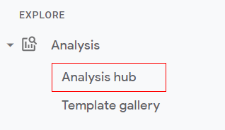
Step 2: Click on ‘Analysis Hub’.
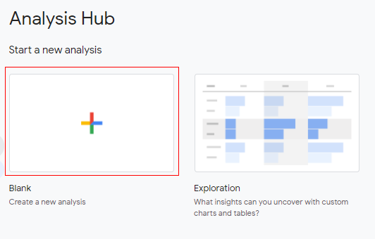
Step 3: You will see the various analysis templates. Click on the ‘+’ sign to select the blank template.
Step 4: A new console will open like below.
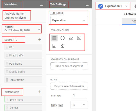
The screen is divided into three columns; ‘Variable’, ‘Tab Settings’ and ‘Exploration’.
Variable Tab:
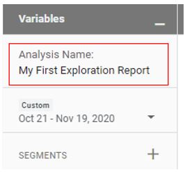
In the context of analysis, segments, dimensions and metrics are called variables. You can also change the date range and report name under the ‘Variable Panel’ column.
Tab Settings:
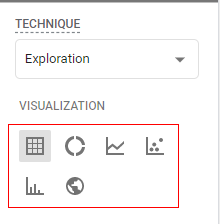
The ‘Tab Settings’ column is for configuring the report technique such as exploration, cohort analysis, path analysis, etc. You can also select the visualization type here e.g. table, pie chart, bar chart, etc.
Get the FREE E-Book (50+ Pages)
Exploration Tab:
The ‘Exploration’ tab is where the data is shown to the user. Whatever configuration that we do in the ‘Variables’ tab and in ‘Tab Settings’ will be reflected in the ‘Exploration’ tab.
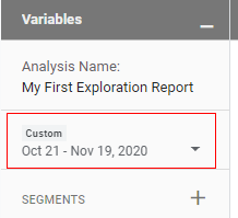
Step 5: Now click on ‘Analysis Name’ to give a descriptive name to the report.
Step 6: Now click on the drop-down arrow to change the date range.
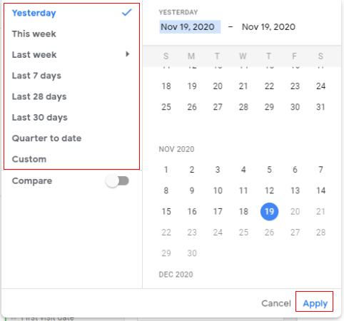
Step 7: You will get a small pop up window where you can specify the date range i.e. yesterday, this week, last 7 days, etc, or set a custom date range. Select your date range and click on ‘Apply’.
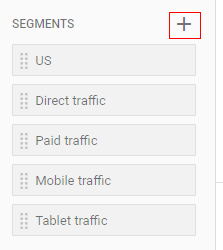
Step 8: Now let’s add segments to out report (optional). You can apply a segment by clicking on the three vertical dots on the segment name and then click on ‘Apply’.

You also get the option to edit and delete the segments. Click on ‘Edit’ if you want to edit the segment configuration. A new overlay will come like below where you can modify the segments by adding more conditions.
If you want to create a new segment then click on the ‘+’ button and define the conditions of your segment.
You can apply up to four segments to your report.
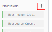
Step 9: Just like segments, you can also create a dimension for the report by clicking on the ‘+’ button under ‘Dimensions’.
If you want to use the existing dimension, just simply drag and drop the dimension either under ‘Rows’ or under ‘Columns’ in the ‘Tab Settings’.
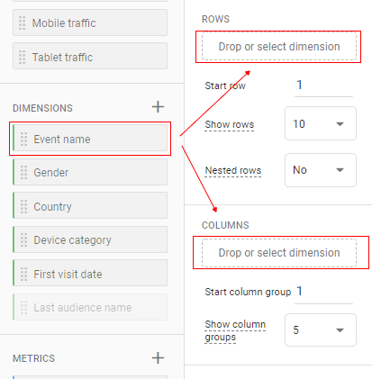
You can also double-click on the dimension name to directly add to the ‘Rows’ section.
If you want your dimension to appear as a row then drag it under the ‘Rows’ section and if you want it to appear as a column then drag it under the ‘Columns’ section.
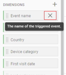
If you want to delete a dimension, just click on the cross ‘X’ in front of the dimension.
You can apply up to five dimensions in rows and two dimensions in columns for your data table.
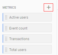
Step 10: Just like dimensions, you can also create a metric for the report by clicking on the ‘+’ button under ‘Metrics’.
If you want to use the existing metric, just simply drag and drop the metric under ‘Values’ in the ‘Tab Settings’.
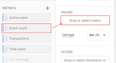
You can also double-click on the metric name to directly add to the values section.
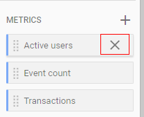
If you want to delete a metric just click on the cross ‘X’ in front of the metric.
Step 11: You can use the ‘Tab Setting’ column to change the configuration of the tabs. If you want to add a new tab click on the ‘+’ button in the ‘Tabs’ panel.
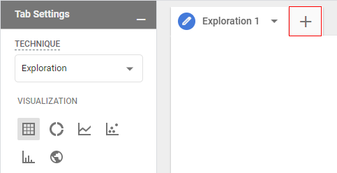
Step 12: A small pop up will open as below. To continue, select the report technique you want.

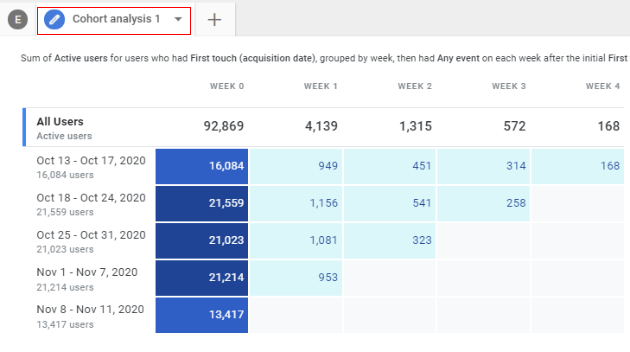
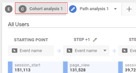
For example, let’s click on ‘Cohort Analysis’, A new tab will open like below.
If you want to add a new tab again, click on the ‘+’ button in the ‘Tabs’ panel, Let’s add the Path Analysis report as an example Click on ‘Path Analysis’ and you will see the third tab added as below.

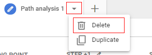
If you want to create a duplicate of the tab, just click on the drop-down menu of the current tab and then click on ‘Duplicate’. This will create a duplicate tab.
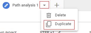
If you want to delete a tab then click on the drop-down menu of the current tab and then click on ‘Delete’.
If you want to switch between the tab the hover your mouse on the tab and then click on it.
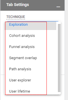
You can change the reporting technique for the report through the ‘Tab Settings’ column.
Just click on the drop-down under ‘Technique’.
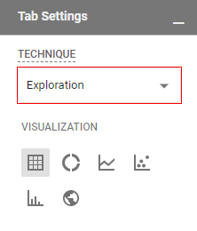
A drop-down will pop up like below, select the technique you want from the available list.
You can also select the visualization type here. Available visualizations are table, pie chart, line chart, scatter plots, bar chart and geo map.
Creating a sample report
Let’s create a sample Exploration report by following the below steps.
Step 1: Click on ‘Analysis Hub’.
Step 2: Click on ‘+’ sign to select the blank template.

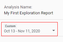
Step 3: Now click on ‘Analysis Name’ to give a descriptive name to the report.
Step 4: Now click on the drop-down arrow to change the date range.
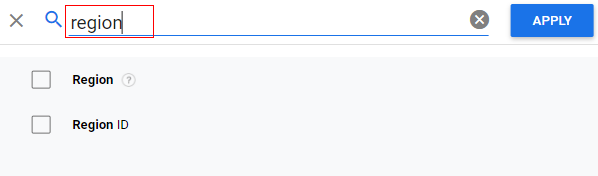
Step 5: let’s apply a dimension to the report. As an example, we will apply ‘Region’ as a dimension. If you look at the below image, the ‘Region’ dimension is not available, so we need to create a new dimension. Click on ‘+’ sign.

Step 6: An overlay will appear as below. Search for the ‘Region’ dimension.
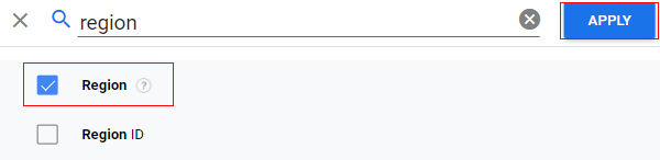
Step 7: Select it and then click on ‘Apply’.
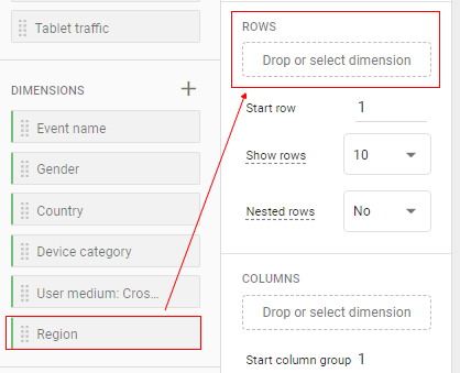
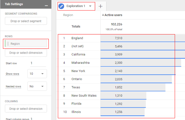
Step 8: Now you can see the ‘Region’ dimension available under the ‘Dimension’ section. But this dimension is still not applied to our report. To apply, drag and drop it under the ‘Rows’ section in the ‘Tab Settings’ column.
Step 9: Now you will see the dimension applied in the ‘Exploration 1’ tab, as below.
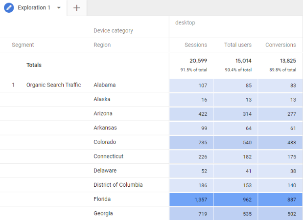
Step 10: Now let’s add another dimension, ‘Device Category’. And this time we will drag it under ‘Columns’.
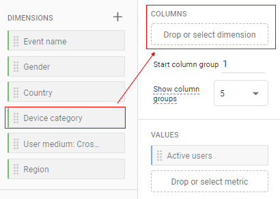
Step 11: Now you will see two dimensions appearing in the ‘Exploration’ tab. ‘Region’ as a row and ‘Device Category’ as a column, like below.
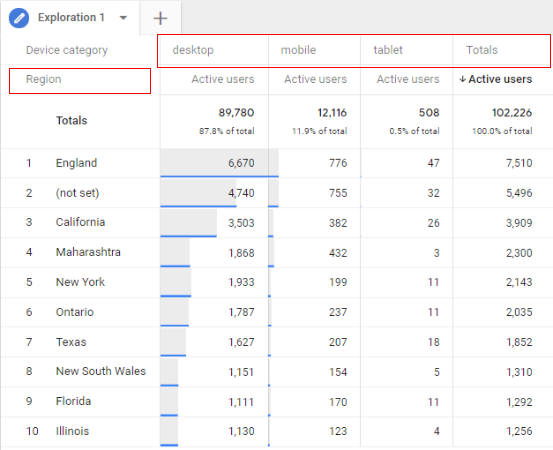
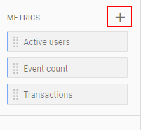
Step 12: Now if you can see from the above image, the selected metric is ‘Active Users’. Let’s remove this metric and add a new ‘Sessions’ metric. Click on the cross ‘X’ in front of ‘Active Users’ to remove it.
Step 13: In the ‘Metrics’ section, sessions is not available so we need to create it. Just click on the ‘+’ button under the ‘Metrics’ section.
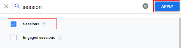
Step 14: An overlay will appear like below. Search for ‘sessions’, select it and then click on ‘Apply’.
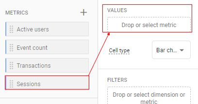
Step 15: Now you can see the ‘Sessions’ metric available under the ‘Metrics’ section. But this metric is still not applied to our report. To apply, drag and drop it under the ‘Values’ section in the ’Tab Settings’ column.
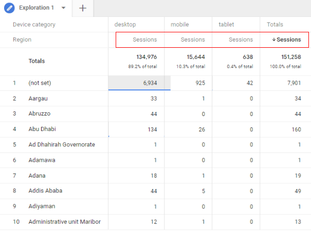
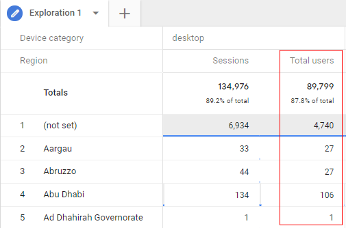
Step 16: You can now see in the ‘Exploration’ tab that the ‘Session’ metric has been added to our report, as below.
Step 17: Now let’s add another metric, let’s say ‘Total Users’. This time it is already available in the ‘Metrics’ section. Double-click on it to add it into the report.
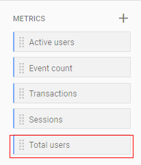
Step 18: You can see the new metric ‘Total Users’ is applied to the report like below.
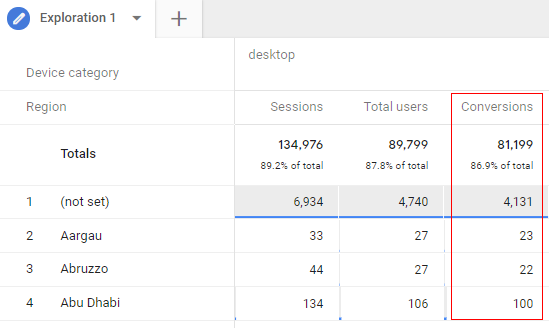
Step 19: Let’s add one more metric to the report, let’s say ‘Conversions’. Since it is not available in the ‘Metrics’ section, we will create it just like we did in the case of ‘Sessions’. Once created, apply it to the report by double-clicking and you will see it in the ‘Reporting’ tab, as below.
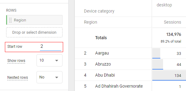
Step 20: If you want your report to start from the second row, you can change the setting to start at row 2, like below, and you will see that the table will start from the second row.
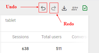
Step 21: If at any time you want to revert back to the previous settings option, you can click on the ‘Undo’ button available at the top of the ‘Reporting’ tab. You can also use the ‘Redo’ button to reverse the last ‘Undo’ action.
Step 22: By default, the report only shows ten rows, if you want to show more rows then click on the drop-down menu and select the number of rows you want to show.
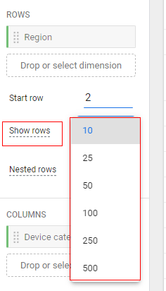
You can see up to 500 rows in your data table.
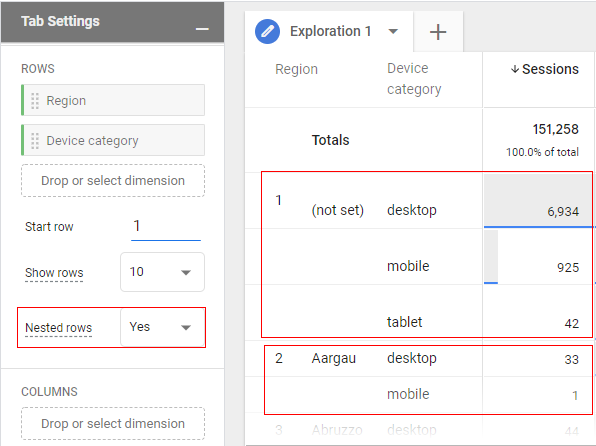
Step 23: Now the next setting is ‘Nested Rows’. This setting will only work when you have two or more dimensions in rows. If you enable it to ‘Yes’, your data in the ‘Reporting’ tab will look like below.
Step 24: If you see from the image, our columns are in the sequence ‘Sessions’, then ‘Total Users’, and then ‘Conversions’.
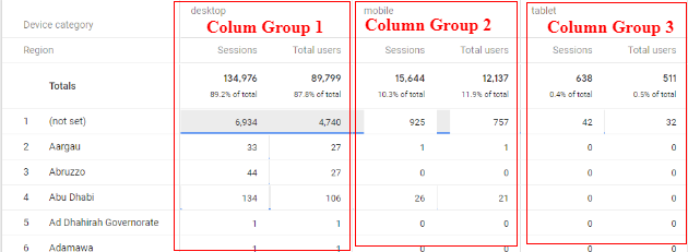
If you want your report to start from the second column you can change the settings in ‘Start Column Group’ like below and you can see the changes in the ‘Reporting’ tab.
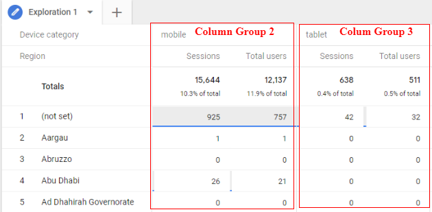
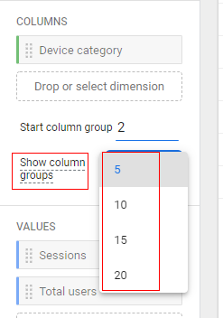
By default, the report shows only five column groups. If you want to show more then you change the settings at ‘Show Column Groups’ up to 20.
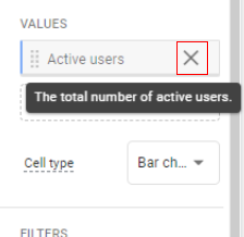
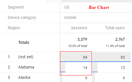
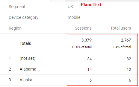
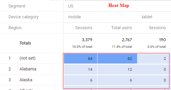
Step 25: The ‘Value’ section is used to add metrics to your report. You can add up to ten metrics to your report. The ‘Cell Type’ setting is used to change how your metrics look in your report. Available options are bar chart, plain text, and heat map.
Applying filters and segments
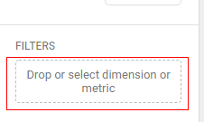
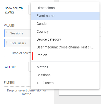
Step 26: Now let’s apply filters to our report. Let’s suppose you do not want to see the (not set) values. Click on the square box under ‘Filter’.
Step 27: A small pop up window will open. Now, since we are looking at ‘Region’ as a dimension in our example, select it from the pop-up.
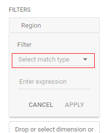
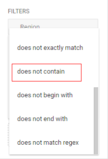
Step 28: Click on the drop-down to select ‘Match Type’ and then select ‘does not contain’.
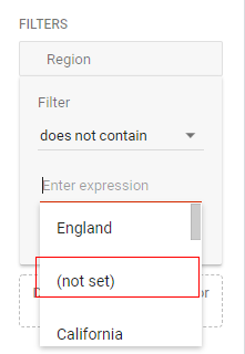
Step 29:Now click on ‘Enter Expression’ and select ‘(not set)’.
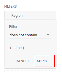
Step 30: Click on ‘Apply’.
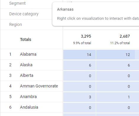
Now you will see in the ‘Reporting Tab’ the ‘(not set)’ value is removed, as below.
So that’s how you can apply a filter to your Exploration report. One important thing to keep in mind is that if you apply more than one filter, it will be applied using AND logic.
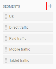
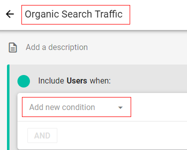
Step 31: Now let’s apply a segment to the report. For example, we will apply a segment to show traffic coming from organic. Since this segment is not available, we are going to create a new segment. Click on the ‘+’ icon under the ‘Segments’ section.
Step 32: An overlay will appear like below. Click on ‘User Segment’.

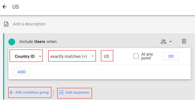
Step 33: Give a descriptive name to your segment and then click on the drop-down to add a new condition.
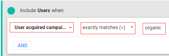
Step 34: Select the dimension ‘User acquired campaign medium’ then match the type to ‘exactly matches(=)’, and the value as ‘organic’.
Step 35: Now click on ‘Save and Apply’.
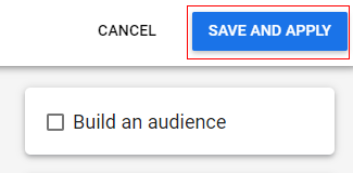
The new segment will be created and automatically applied to your report.
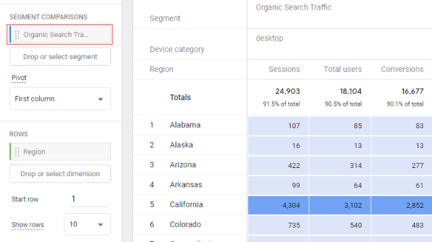
Step 36: Once you define and apply the segment, a new setting ‘Pivot’ is available under the ‘Segments’ section which can be used to show how your segment is displayed in the report.
There are multiple options available in the settings like now our segment is displayed as ‘First Column’.
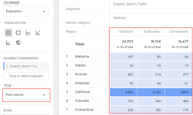
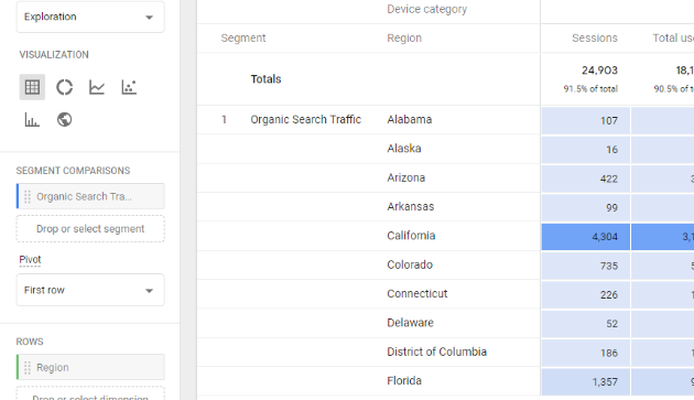
You can select other options as well, for example, let’s select ‘First Row’ from the drop-down in pivot and our report will look like below.
You can also apply a filter in the ‘Reporting’ tab, let’s say you only want to see data for California, just right-click on it and you will get options like below.
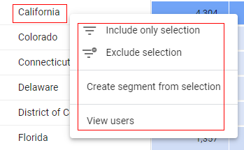
Select the filter you want to apply (‘Include only selection’ or ‘Exclude selection’) and it will reflect in your report.
Option 1: If you select ‘Include only selection’ it will be reflected in the ’Reporting’ tab as well, as in the below image.
![’Reporting’ tab<[Include only selection’ or ‘Exclude selection]](https://ga4guide.com/wp-content/uploads/2021/02/69.png)
Option 2: If select ‘Exclude selection’, other regions other than California will be shown.
Option 3: You can also create a segment from a selection. It will open a new overlay like below.

Click on ‘Save’
Option 4: You also get the option to view users for the selected dimension. Just click on ‘View user’ and your report will show user details as below (a new ‘Reporting’ tab will open).
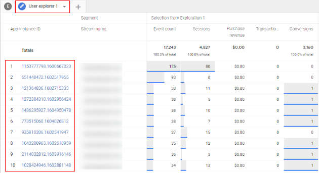
With the ‘User Details’ tab, you can explore more on the activities done by users in great detail.
Sharing and downloading a report
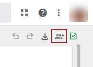
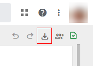
Step 37: You can share the report template with other colleagues as well. Just click on the ‘Share’ icon available in the upper right corner of the ‘Reporting’ tab.
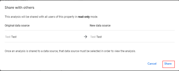
Step 38: It will open an overlay with details as below. Click on ‘Share’.
Step 39: You also get an option to download the report. Click on the ‘Download’ button.
A small pop up will appear, as below, where you can specify the report format type.
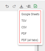
Available options are
- Google Sheets
- TSV (Tab Separated Value)
- CSV (Comma Separated Value)
- PDF (all tabs): this will download all the tabs in reporting panel in PDF format.
The green check icon that appears simply means that your report is not sampled.
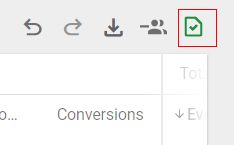
If your data crosses ten million rows then your report will be sampled.
This is how you can use the ‘Exploration’ report and various options available in Google Analytics 4.